 So here's another interesting study that I highlight here because it has to do with color, and of course, at ColorCodeMode.com we are all about color.
I'm just not sure of this study's overall value in the battle against obesity.
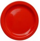
Apparently people consume fewer calories when eating off red-colored dishes because red implies "stop."
There could be other reasons a person would eat less off a red plate.
As someone who is sensitive to color combinations, I'm guessing food doesn't look particularly appetizing on a red plate (think brownish-pinkish steak, or spaghetti, or salmon, or any food with reds or pinks that might look a little "off" against the red of the plate.) And if the "stop" theory is valid, shouldn't one eat more from a green plate (since green implies "go")?
Apparently they didn't test that.
White plates induced the highest intake of calories, according to the study. Then blue plates.
Of course, I eat off blue and white plates.That explains things a bit... 
Strolling through the china department of a retail store, how many sets of red dishes do you see? Not many. Not that I would invest in red dishes anyway for the sake of testing a theory.
But my grocery store carries some relatively inexpensive, garish red plastic plates, which might make it practical for me to test out the theory. (Although the fact I'd be eating off plastic plates might also cause me to eat less, so there goes the validity of the test.)
Eating off red plates is something that would be easy to track in either the Streaming Colors Fitness Journals or the Lean Mode Food Diary. You could even use one of the red highlighters in the Zazzle Brights 10-pack we sell in our online shop. (Not many highlighter sets have an actual red pen.)  Zazzle Brights red highlighter is actually a bit more cherry red than shown here
If you decide to track it, let us know how it goes.
If you really wanted to eat less, while you dined you could stare at this photo of a carpet pattern that within five minutes induces seasickness.
Sorry I can't show it here because it makes me sick to look at it—in less than five minutes. Just thinking about it makes me queasy. But then, I am really sensitive to motion sickness.
Apparently your brain picks up a sense of motion from the vibrating moire pattern created by strongly contrasting colors intersecting at weird angles.
Maybe for the next study someone could print one of those black and white moire patterns onto a dinner plate, with a big splotch of red for good measure.
Wait a minute. I think stores sold those plates in the sixties, probably out of Melamine, when op art was trendy.
Don't make me go back there. I never liked those dishes.
(Then again, people were a lot skinnier.)
There are probably lots of things we could do to put the skids on our enjoyment of eating, but would we actually go through with it? The whole idea runs counter to the philosophy of savoring everything about the experience of dining with our friends and family.
How about this? Instead of worrying about the color of our plates, we could end the subsidies for fat-inducing high-fructose corn syrup, and instead subsidize the more costly but colorful, nutritious fruits (like cherries, for example) that should make up a much larger portion of our diet. 
That would help put a healthy spot of color on more American families' plates — no matter what color plate they like to use.
